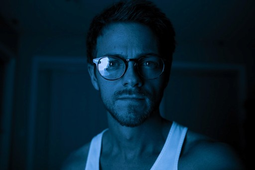
Chloe Brown
Apr - Jun 2023
Candidate for Toronto's Mayoral Campaign
Go from design to site with Framer, the web builder for creative pros.
READ CASE STUDY >
Overview
Chloe Brown is a Policy Analyst who ran to be elected as the Mayor of Toronto in fall of 2022 and placed 3rd on a shoestring budget against John Tory (elected Mayor) and Gil Peñalosa (2nd place). When John Tory stepped down from his role as Mayor in March 2023, a by-election was announced. The allotted campaign period was April - June 2023 with voting on June 26, 2023. Chloe decided to run again, but this time with a small team of “neuro-spicy” creatives by her side. This election, she placed 7th (18,831 votes) against 100 other candidates.
Approach
I led the design for the campaign website, tightened the visual branding for accessibility, adapted policy content to consumable digital formats, and created ongoing supporter engagement through an email campaign in collaboration with a copywriter.
I teamed up with the creative director to ensure brand consistency across all digital platforms and printed campaign materials. I partnered with engineers to integrate, and test MailChimp funnel experiences connected to the website. I worked with the campaign manager to create a branded deck to showcase how Chloe would use her fiscal budget for Toronto. I also worked with the volunteer director to create a team structure and onboarding presentation for interested volunteers.
Designing for empowerment
How might we empower, educate and involve eligible voters to participate in the politics of Toronto? #TOpoli
Funding the Campaign Activities
In Ontario, each campaign can only spend as much as they receive. The maximum contribution per individual is 2,500 CAD. And the maximum contribution per candidate is 7,500 CAD. The success of the campaign depends on donations.
To enable quick donations, I used a Stripe payment link and connected it to a bold button on the navigation. I customized the donation page to create a cohesive brand experience and added a chart to help donatees decide their donation value based on what they would receive back.
IMPACT: By creating a clear call to action and fast integration, we raised ~ $50k CAD in less than 3 months, a solid 25x more than the last campaign.
Content Design: Policy Platform + Budget
The most important aspect was making the policies more accessible. As a policy analyst, Chloe Brown is educated and academic however, political terminology is not accessible to the average voters. The media was also not actively supporting Chloe through policy press releases. We decided to take matters into our own hands and create a blog that hosts all the policies in one place.
I took her policy write-ups, and converted them into slightly more consumable format using blogs.
By adding headings and images to break up long form text, drawing attention to headlines that will catch reader’s attention based on what they care about. I added alt text to visuals. We created our own press releases.
Mobilising Volunteers + Lawn Signs
The next thing was mobilising volunteers to help with physical outreach in the form of canvassing, help with organising community outreach events to increase Chloe’s presence in the city and give more people an opportunity to get to know her directly.
I created a team structure and lead volunteer onboarding for the first wave of volunteers who joined #TeamCB4TO.
Designing for outreach and engagement
Digital engagement and support
We also started a newsletter campaign to engage supporters and voters already involved so that they don’t forget about the election. As part of our physical outreach strategy, the team was hosting in-person events across the city
Calls to action:
Donate
Show up to events
Important dates
Recapping policy to make it more accessible
I designed the newsletter to keep it consistent with the brand and collaborated with a copywriter to work on the content.
Content Design: Policy Platform + Budget
The most important aspect was making the policies more accessible. As a policy analyst, Chloe Brown is educated and academic however, political terminology is not accessible to the average voters. The media was also not actively supporting Chloe through policy press releases. We decided to take matters into our own hands and create a blog that hosts all the policies in one place.
I took her policy write-ups, and converted them into slightly more consumable format using blogs.
By adding headings and images to break up long form text, drawing attention to headlines that will catch reader’s attention based on what they care about. I added alt text to visuals. We created our own press releases.
Designing for brand recognition and accessibility
Digital engagement and support
*Directed brand accessibility to ensure the visual brand, and messaging were easy to comprehend by all voters (including edge cases)
When I received the brand identity guidelines there were 5 accent colours. I narrowed down the branding to 3 colours. One base colour, a primary colour and an accent colour of green. I collaborated with the creative director to create a typography guidelines that could be used across multiple platforms.
Brand guidelines
~ image of brand guidelines ~
~ social content images - Tiktok, Instagram, LinkedIn, Twitter ~
Impact: social growth and comments about how awesome the aesthetic was
~ comments from IG about aesthetic and accessibility ~
What we needed to do for print and why
Print - campaign cards, lawn signs, merch (totes, shirts), volunteer shirts
~ images of print mockups ~
Masterminds
Meet the visionary talent behind this web design case study, each a virtuoso in their own right.

Maxwell Grant
Lead Designer

Violet Hastings
UX Specialist

Alberto Martinez
Backend Wizard
Thanks for stopping by!
I'm always open to collaboration and brainstorming.
Get Started
Learn More


